21st Birthday rebranding
Posted: 09 November 2018
21 years is a big birthday and on celebrating this milestone, there has been time for reflection on how the organisation has evolved and developed over the years. Along with these thoughts came the sense it was time to acknowledge the changes and to think about a rebranding that would accurately convey the essence of what we are about as an organisation and how we want to be experienced by people accessing and attending the service.
We were also wanting to take the centre forward with a fresh contemporary feel and so looked for something quite symbolic in design whilst using a colour palate that would communicate the warmth and comfort that all members of the charity work hard to achieve.
We engaged the services of graphic designer Michael Marks and initially shared with him something of who we are, how we work and what we wanted from the rebrand. He came back with a number of different designs. It was important to us that as a cohesive team we gave all those working with us, the opportunity to have input into the rebrand. So on our 21st birthday party we had a ballot and everyone voted for what they liked.
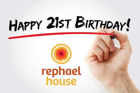
The outcome is the design and colour palate that you see on our website today.
Michael’s thinking behind this is in keeping with our service - the inside of the shape symbolises the emotional difficulties that we can face at times and what might bring a person to our door, whilst the holding circle represents the firm yet gentle therapeutic containment provided by the team. It also symbolises the overall support and strength offered at the charity. The colour palate is warm and relatively bright, optimistic and yet comforting, lighting the way to a more positive future for our clients.
We would like to thank all our staff and also the creative abilities of Michael for enabling us find our new Logo.
We were also wanting to take the centre forward with a fresh contemporary feel and so looked for something quite symbolic in design whilst using a colour palate that would communicate the warmth and comfort that all members of the charity work hard to achieve.
We engaged the services of graphic designer Michael Marks and initially shared with him something of who we are, how we work and what we wanted from the rebrand. He came back with a number of different designs. It was important to us that as a cohesive team we gave all those working with us, the opportunity to have input into the rebrand. So on our 21st birthday party we had a ballot and everyone voted for what they liked.
The outcome is the design and colour palate that you see on our website today.
Michael’s thinking behind this is in keeping with our service - the inside of the shape symbolises the emotional difficulties that we can face at times and what might bring a person to our door, whilst the holding circle represents the firm yet gentle therapeutic containment provided by the team. It also symbolises the overall support and strength offered at the charity. The colour palate is warm and relatively bright, optimistic and yet comforting, lighting the way to a more positive future for our clients.
We would like to thank all our staff and also the creative abilities of Michael for enabling us find our new Logo.
SHARE